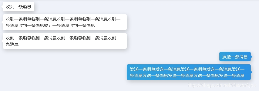
效果图

HTML代码
<a-row :gutter="10">
      <a-col :span="24" style="margin-bottom: 10px">
        <div class="chat-bubble chat-bubble-left">
          <span>收到一条消息</span>
        </div>
      </a-col>
      <a-col :span="24" style="margin-bottom: 10px">
        <div class="chat-bubble chat-bubble-left">
          <span>收到一条消息收到一条消息收到一条消息收到一条消息收到一条消息收到一条消息收到一条消息收到一条消息</span>
        </div>
      </a-col>
      <a-col :span="24" style="margin-bottom: 10px">
        <div class="chat-bubble chat-bubble-left">
          <span>收到一条消息收到一条消息收到一条消息收到一条消息收到一条消息</span>
        </div>
      </a-col>
      <a-col :span="24" style="margin-bottom: 10px">
        <div class="chat-bubble chat-bubble-right chat-bubble-primary">
          <span>发送一条消息</span>
        </div>
      </a-col>
      <a-col :span="24" style="margin-bottom: 10px">
        <div class="chat-bubble chat-bubble-right chat-bubble-primary">
          <span>发送一条消息发送一条消息发送一条消息发送一条消息发送一条消息发送一条消息发送一条消息发送一条消息发送一条消息</span>
        </div>
      </a-col>
    </a-row>
CSS样式
.chat-bubble{
  color: #333;
  border-radius: 5px;
  box-shadow: 3px 5px 15px rgba(0,0,0,.2);
  padding: 5px 10px;
  width: auto;
  max-width: 50%;
  text-align: left;
  display: inline-block !important;
  position: relative;
  word-break:break-all;
  background-color: #ffffff;
  transition: all .2s;
  cursor: pointer;
}
.chat-bubble:hover{
  transform: scale(1.03);
}
.chat-bubble-left{
  float: left;
}
.chat-bubble-left:before{
  content: '';
  width: 10px;
  height: 10px;
  left: -10px;
  top: calc(50% - 5px);
  position: absolute;
  border-left: 5px solid transparent;
  border-bottom: 5px solid transparent;
  border-top: 5px solid transparent;
  border-right: 5px solid #ffffff;
}
.chat-bubble-right{
  float: right;
}
.chat-bubble-right:after{
  content: '';
  width: 10px;
  height: 10px;
  right: -10px;
  top: calc(50% - 5px);
  position: absolute;
  border-left: 5px solid #ffffff;
  border-bottom: 5px solid transparent;
  border-top: 5px solid transparent;
  border-right: 5px solid transparent;
}
/**
   chat-bubble-primary
 */
.chat-bubble-left.chat-bubble-primary{
  background:linear-gradient(90deg,#2b92e4, #30a1dc) !important;
  color: #ffffff !important;
}
.chat-bubble-left.chat-bubble-primary:before{
  border-right: 5px solid #2b92e4 !important;
}
.chat-bubble-right.chat-bubble-primary{
  background:linear-gradient(90deg,#30a1dc,#2b92e4) !important;
  color: #ffffff !important;
}
.chat-bubble-right.chat-bubble-primary:after{
  border-left: 5px solid #2b92e4 !important;
}
/**
   chat-bubble-success
 */
.chat-bubble-left.chat-bubble-success{
  background:linear-gradient(90deg,#4caf50, #66b869) !important;
  color: #ffffff !important;
}
.chat-bubble-left.chat-bubble-success:before{
  border-right: 5px solid #4caf50 !important;
}
.chat-bubble-right.chat-bubble-success{
  background:linear-gradient(90deg, #66b869,#4caf50) !important;
  color: #ffffff !important;
}
.chat-bubble-right.chat-bubble-success:after{
  border-left: 5px solid #4caf50 !important;
}


评论区